Paint Color Trends 2020 - Introducing the Sherwin-Williams Colormix Forecast
If you’re a big interior design nerd like me, it’s a great day when Sherwin-Williams releases their color trends for the upcoming year.
Luckily for us, I was able to get one of Sherwin-Williams color forecast team members to submit to a gruelling Q & A session about their Colormix Forecast for 2020.
Emily Grundy is not only Sherwin-Williams’ designer account executive for Canada, she is a fine arts grad from OCAD University in Toronto, a member of the Interior Designers of Canada (IDC), Decorators and Designers Association of Canada (DDA) and a proud member of the arts community in Toronto.
And today, she is going to spill the beans on how the Sherwin-Williams color forecast team arrived at their paint color trends for 2020.
NOTE: My questions are in bold. Emily’s answers follow.
I want to start with an overall description of this year's SW colors and how they are divided into 5 different themes....
Give me a general description of this year's color choices
Why they are the colors divided into different themes?
Describe those themes?
We are seeing trends this year leaning towards looking inwards, understanding personal health and wellness in this one great life we’re given. Our relationships, environments and material health comes increasingly into focus with trends driven by reflecting your own personality within your space. Developing a sense of human in our interiors is increasingly important, long gone are the days of an one size fits all aesthetic approach in design. The shift into personal reflection is definitely here. We’ve divided our colors this year into five curated themes, Alive, Mantra, Play, Haven & Heart. The overall connection between these colors is balance. Each group represents a moment in life, our lives are forever changing and evolving – and we think design should reflect that. Creating balance is crucial when selecting colors, tonality, style and composition for a space, these five themes reflect that ideology.
How are colors chosen?
Where does the team begin? What are the inspirations? What are the limitations.
How do the 5 themes relate to each other?
Our color forecast team first starts by selecting overall categories. These are the general topics we want to explore within the trends we see moving forward into next year.
Once we’ve selected the overall vibe for each category we begin to explore the trends which support each palettes mood. We look at many different elements of design, and we don’t stop at residential or commercial. We explore fashion, art, textiles, fabrics in carpets, drapery, even trends in glassware, dinnerware, flatware and furniture design! No stone left unturned in my opinion, we frequent design concept shows such as Interior Design Show in Toronto, Chicago’s best in design show, Neocon.
The guiding force comes from exploring all elements of design and the interesting thing is somehow it always ends up facing the same direction.
After all the categories are selected, we then begin to divide the research of our trends into the categories. If we see certain colors that are continuously being represented in a certain way we group them together. This is the most chaotic part of the process but also when you begin to get some clarity and start to see the overall patterns that come into play.
After we’ve conquered the research portion of the trends, we then head to our Sherwin-Williams color line to find the perfect colors to represent each theme. We pull colors from fabric, imagery, art works, concept furniture design etc. Once we’ve selected the correct hue, its tonality is explored. We look at each color set and analyze how it will be displayed, which colors will take a more primary approach and which will be a more supportive role.
We further develop each color set to its relation to each other, this is where the whole “color in balance” comes into action. Each one of these colors needs to be able to speak to it’s color neighbour. We wanted to create something that has the ability to be diverse, you don’t have to utilize all the colors together within each palette, you can essentially “mix and match” your design….creating a “true to you” design style.
Who are the people choosing Sherwin-Williams’ colors of the year?
What are their roles, education, work experience, training, etc?
Info on the entire Sherwin-Williams color forecast team can be found here.
The 5 Sherwin-Williams Color Palettes & 45 Color Trends for 2020
Alive Palette
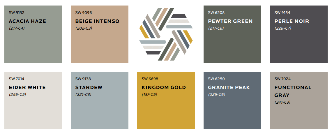
Our Alive Palette is influenced by Optimism, authenticity & the New Local. This palette has a very open and inviting sense of color. Its neutrals are curated in a way that suits a variety of different tonalities ranging from cool to warm.
These colors have a very global feeling and are very rich in nature, from SW 6209 Ripe Olive (217-C7) - a deep viridian green - to contrasting SW6369 (128-C5 ) Tassel - a beautiful orange gold. In a sense, these colors are very traditional....greens and blues mixed together.
The thing that’s different about the Alive palette is the addition of the warm undertone colors which heighten the passion of the navy and deep olive when seen together.
Mantra Palette
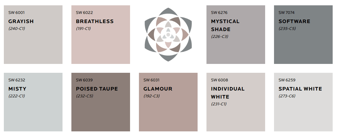
Mantra is our most subdued palette, but in no way should this ultra-light palette be taken lightly! It’s influences are minimalism, serenity, scandinese & sanctuary. This palette is all about balance.
Mantra creates a push/push effect with Nordic simplicity and the order and elegance of Japanese aesthetic. It’s filled with beautifully toned neutrals, which slide seamlessly from warm to cool undertones. I think the most impressive part of this palette is the addition of SW 7074 Software (235-C5) .
When seen by itself, Software is a bold choice in its depth of color, but when paired with SW6232 Misty (222-C1) and Spatial White SW6259 (273-C6) it seems to dim the color and almost brings it to a more neutral ground. This palette to me, represents visual serenity.
Play Palette
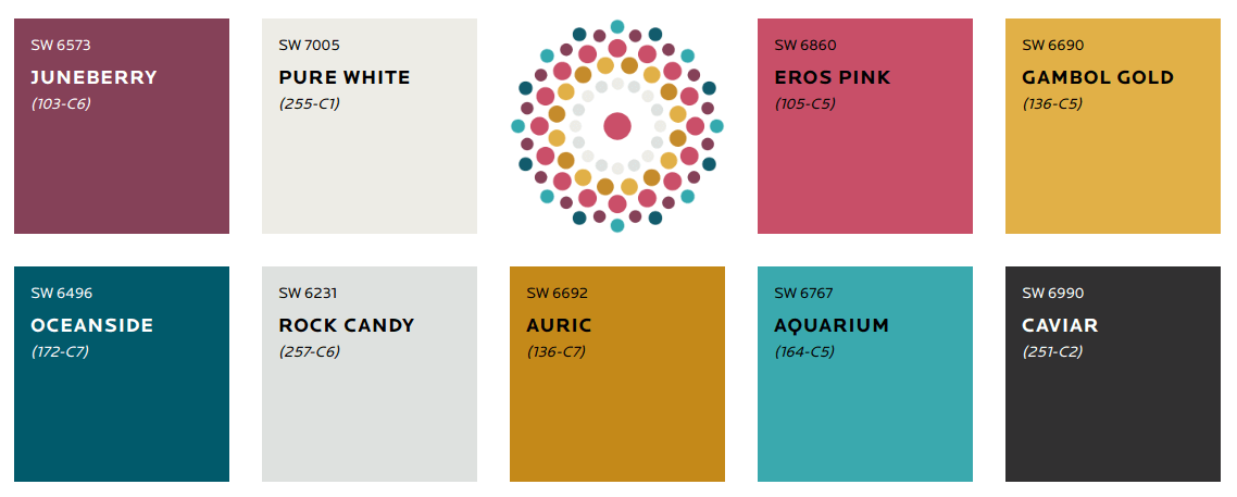
Play is our third and most daring palette – its influences are Escapism, Humor, Joy and Energy.
This palette represents the bold in design. it’s for those who truly want a space that is representative of their true being, their playful nature and expect to shock and awe their guests.
On the other hand, this palette is also very versatile. Within all of these palettes, we’re not always suggesting to use ALL of the colors as wall paint, we know you’re not trying to create a circus in our space. Sometimes the pops of color can be seen in your artwork, the fabric on your new couches or even the fresh flowers you bring in from the garden. It’s all about personality in this palette. Every color in this set is unique, when paired together or seen separately. Some say that white is a color, but for me it’s an absence of color which allows us to create this shocking backdrop to these wild but tamed colors!
Haven Palette
Haven’s influences are simplicity, Wabi-Sabi, Conservation and material health. This palette is the representation of “home” We’ve selected colors that draw you in and encourage you to be inspired by seasonal changes. Rich and subtle shades of sea, sand, forest and sky. These calming tones of blues, greens, yellows and pinks flow effortlessly in this palette.
The concept of wabi-sabi, or the art and love of the imperfect as its known is being embraced by most these days. Wabi-sabi helps us realize the need to carve time out of our busy schedules for mindfulness and contemplation and to keep the idea of spatial and material health in the forefront.
One of the biggest concepts in Haven’s designs is the idea of conservation. As we move forward we need to ensure our designs reflect the protection of our planet. As we strive to make things more beautiful, we want to ensure we’re not creating destruction in our wake, this palette is a visual reminder to be aware!
Heart Palette
Our last and most harmonized palette is called Heart. This palette is influenced by Bauhaus, Bohemian, Fusion and Humanity. We called this palette heart because of its connection to a variety of genres and emotions. It’s a unique fusion of iconic modern design mixed with an intergenerational boho vibe.
This mediation on comfort, connection and pleasures of everyday stem from a place of balance. By utilizing similar undertones, this palette screams soft yet refined. These interconnected tones will suit almost any color set. By using a monochromatic color palette, you can harmonize almost any space. With the addition of SW9005 Coral Clay (114-C4) it adds a fun color dynamic of the unexpected.
How do different theme colors work for homeowners...are certain colors designed for walls and others for trim work?
For homeowners viewing these color choices, I would recommend that we acknowledge our unconscious color choices, because we make them every day!
It’s more than the color of clothes we choose or even the color lipstick you love… it’s the color of collar you picked out for your pet, it’s the color of t-shirt you picked for your kid, realizing that they already have 4-5 of the same color or even the flowers you always gravitate towards.
With trend colors, we have a tendency to ignore our own personal taste and move toward what’s trendy at the time. My best piece of advice would be to choose what you love, it will make a statement with how you pair it with what’s in your home. All of these trend colors can be wall colors, it depends on your personal style and how you want to be represented in your designs. There are some traditionalists who would love to say, your baseboards need to be white! But I have seen some beautifully unique homes with dark glossy tones gracing the walls AND the trim work and it works! Whether your choosing to be bold or neutral, we’ve created a unique set of colors that can add balance to any space.
I have one final tip to help homeowners with their color selections. Sherwin-Williams has this great smartphone/tablet application that can help, it’s called ColorSnap. You snap a photo of whatever sparks your interest and it will find all of the coordinating colors in the photo. You can also digitally paint your walls, to try the colour before you buy!
About the Author
EMILY GRUNDY - Designer Account Executive, Canada
Emily supports the residential interior designer market with color and paint specifications and provides continuing education for designers and industry partners. She works with the Canadian design account team.
Dedicated to the exploration of color and trends, Emily studied fine arts at OCAD University in Toronto. She is an allied member of the Interior Designers of Canada (IDC), Decorators and Designers Association of Canada (DDA), and the Association of Registered Interior Designers of Ontario (ARIDO), and a proud member of the arts community in Toronto.
Email: Emily.t.grundy@sherwin.com
Instagram: @emily_grundy_


